The O collection
Typography
Print Design
Pattern Design
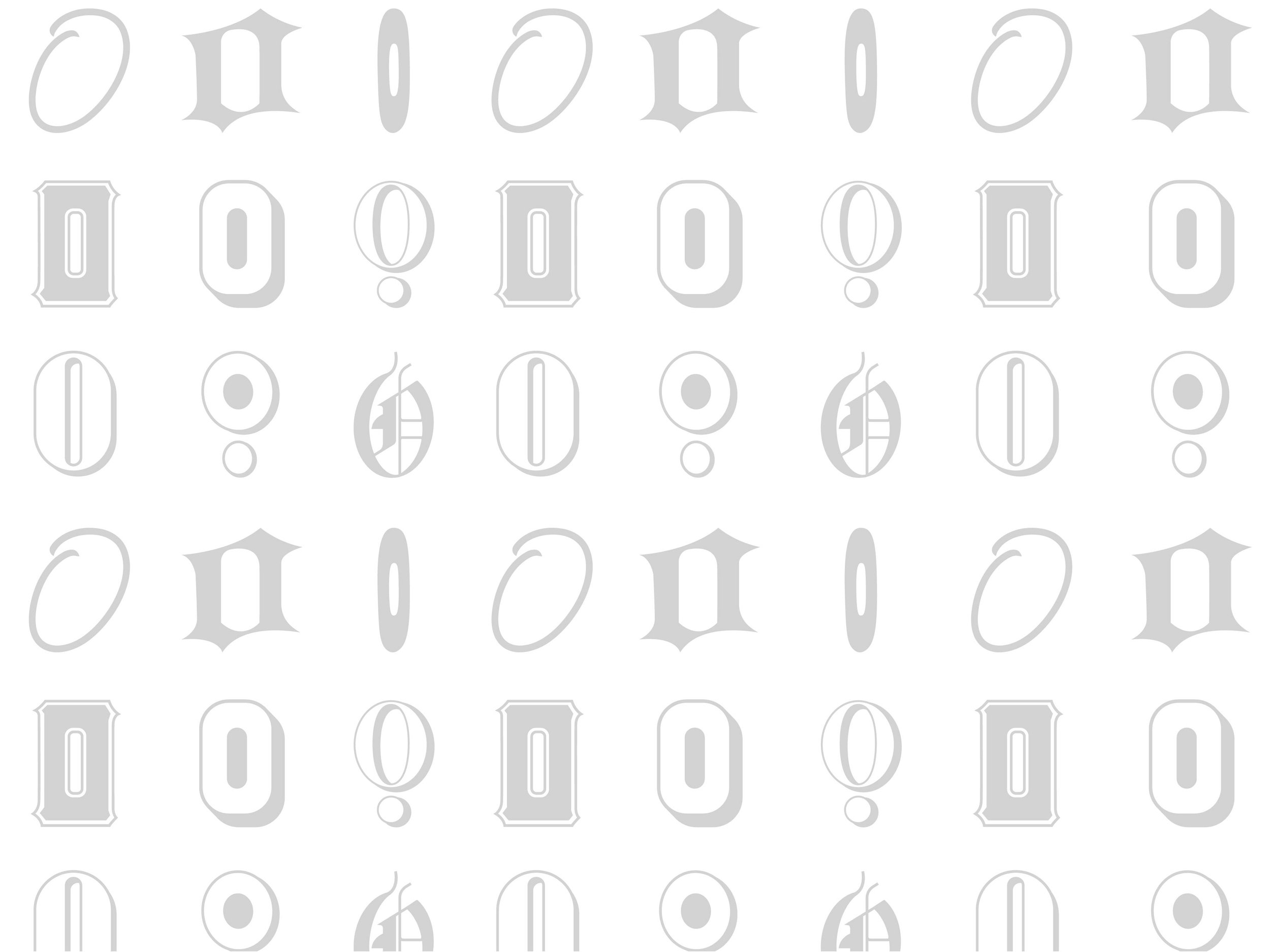
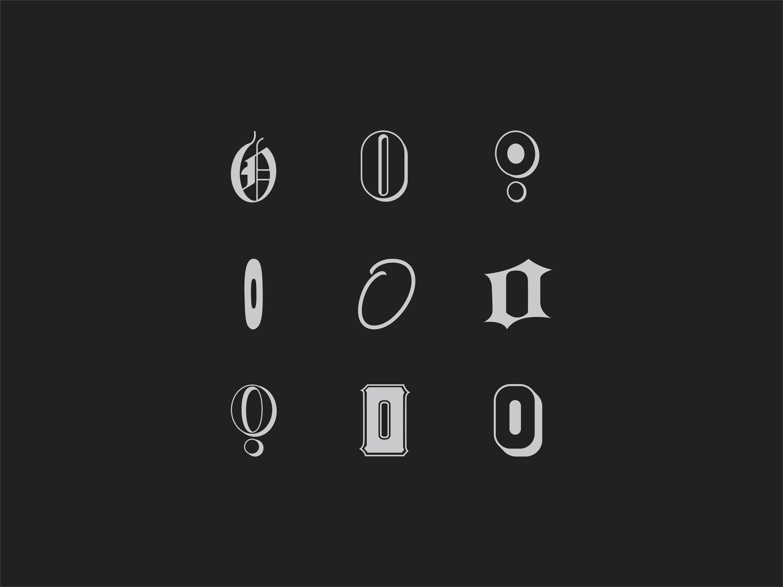
The O Collection is a line of company swag for Olberding Brand Family. The project Scope was to come up with ideas that push the existing Olberding brand while incorporating some needed character. My goal was to honor OBFs heritage and look forward to the future through a mix of traditional and futuristic typefaces I found in a company document from 1919. The O’s also represent the diverse work and backgrounds found within OBF.


